Graphic design - photographer
Mooncake Gift Box
Branding, Packaging,
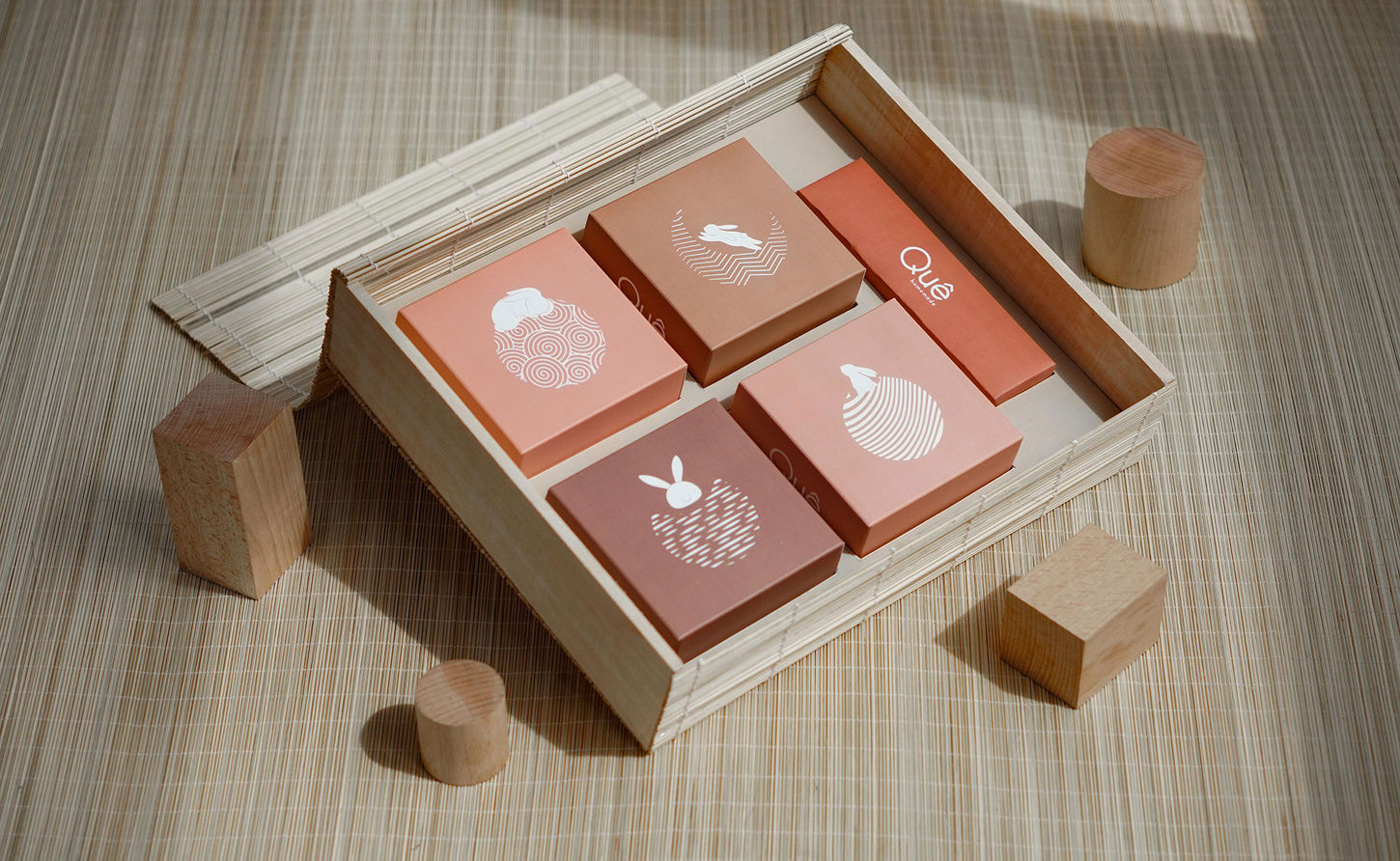
While my responsibility is to strengthen Brand Identity of Que Homemade, I was in charge of conceptualising and designing packaging of Mooncake products for this year’s Mid-autumn festival.
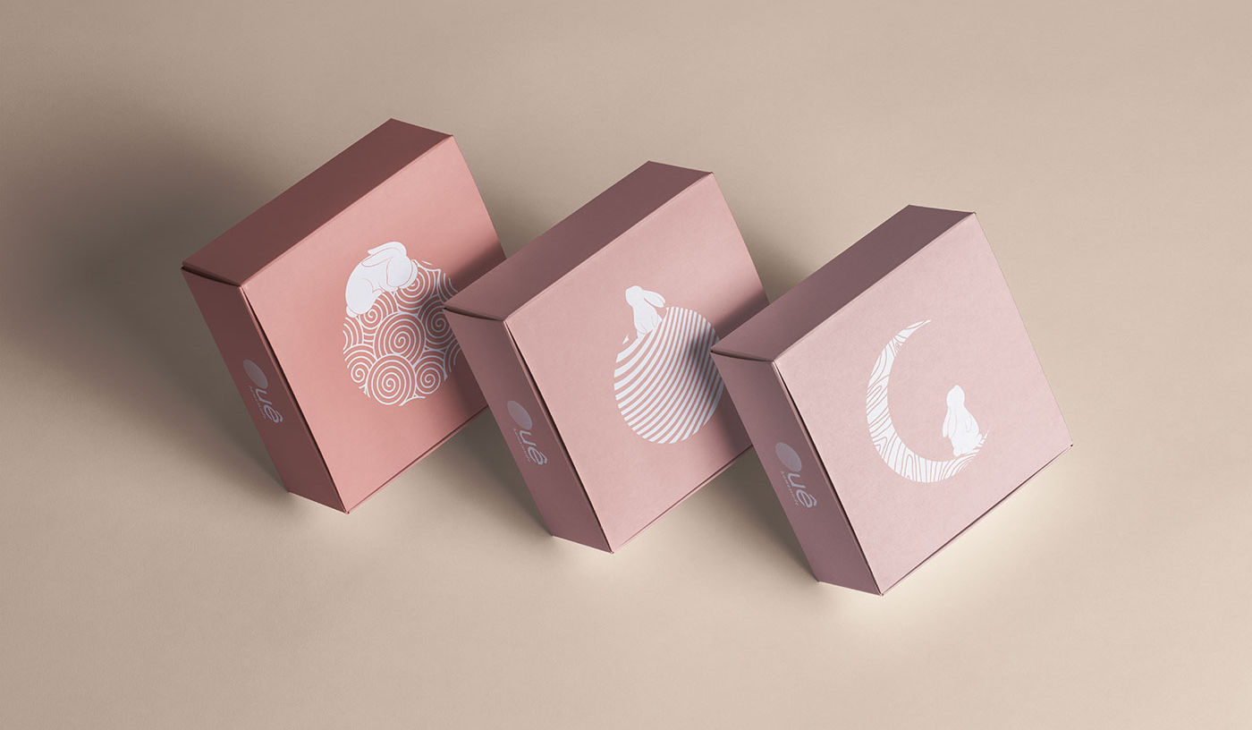
From the outset, I identified that a fresh, contemporary, abstract and bold packaging design would benefit this brand's ambitious goals. With the visual and sensory aspects of the products. We started to create illustrations that were inspired by the phases of the moon and rabbits -one of the symbols of the Mid-autumn festival. These illustrations were then put together to create the connection, representing a warm Mid-autumn festival.
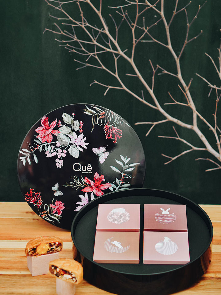
We chose to name these boxes, "Hope", "Love", "Faith" & "Moon" to create a synced theme and meaningful message.
Hope
|
Box with unique design of bamboo curtain box, bold of the brand
The box sends the hope of peace, soothes the anxious soul
Faith
|
Inspired by Mizuhiki (Japanese Knots)
The box sends the hope of peace, soothes the anxious soul
Love|
|
Inspired by blue and white porcelain enamel
Flowers skillfully form the perfect symmetry of love. Contains sweet things, loving energy
Moon|
|
Box with a circular design like the full moon illuminating everything in the night
The picture of nature shows up so lovingly and gently


